This tutorial covers reading a processed input file from AIVIA to generate an example report and 3D plots required for interactive data visualization. The instructions for package installation can be found here.
For this tutorial, we will use example data from cell line derived extracellular vesicle imaging data. The data can be downloaded here.
Creating a Cygnus Object
To create a Cygnus object, specify metadata and markers columns from
the input .csv file. You can use an interactive Shiny app
or directly provide the column names.
data.path <- "../inst/extdata/all_cells.csv"
# cyg <- CreateCygnus(data.path) # Starts the interactive app

cyg <- CreateCygnus(data.path,
                    markers_col = c("PanEV", "EpCAM", "MET",
                                    "SDC1", "EGFR", "ADAM10",
                                    "CTSH", "PDL1", "HER2"),
                    meta_col = "celltype")

cyg
## Summary of CygnusObject:
## Slot: [1] "Raw_Score"
## Numer of EVs: [1] 3264Object Structure and Metadata
When creating a Cygnus object using the CreateCygnus() function, the meta_col parameter refers to a column in the input .csv file that contains additional information about each EV. This may include sample annotations (e.g., indicating different cell lines), morphological characteristics (e.g., circularity), or clustering details.
Cygnus objects also store metadata for each marker. This can include information such as marker relevance (i.e., whether a marker should be included for clustering), which will be demonstrated later in this tutorial. To view the overall structure of the object,
# view(cyg)You can also add metadata from another file using the following format:
cyg@ev_meta[['type']] <- "cell_line"

# To view all metadata,
str(cyg@ev_meta)
## List of 2
## $ celltype: chr [1:3264] "A549" "A549" "A549" "A549" ...
## $ type : chr "cell_line"Pre-processing and Normalization
For exploratory analysis, examining the distribution of expression scores can be useful. This helps identify potential outliers and informs decisions around scaling or normalization to address batch effects or enable meaningful comparisons between markers.
Visualizing Marker Intensity Distribution
To visualize the score distributions for all markers:
plotDistribution(cyg)
Sometimes, marker distributions can vary between samples. For example, in this case, the expression distribution of EpCAM (one of the markers used) differs depending on the cell line. To group distributions based on metadata, you can use the group_by parameter:
plotDistribution(
    obj = cyg,
    plot_markers = "EpCAM",
    matrix = "Raw_Score",
    group_by = "celltype",
    group_colors = c("A549" = "#FF7966", "H2228" = "#CB8FF8", "KP" = "#7CC0F6")
)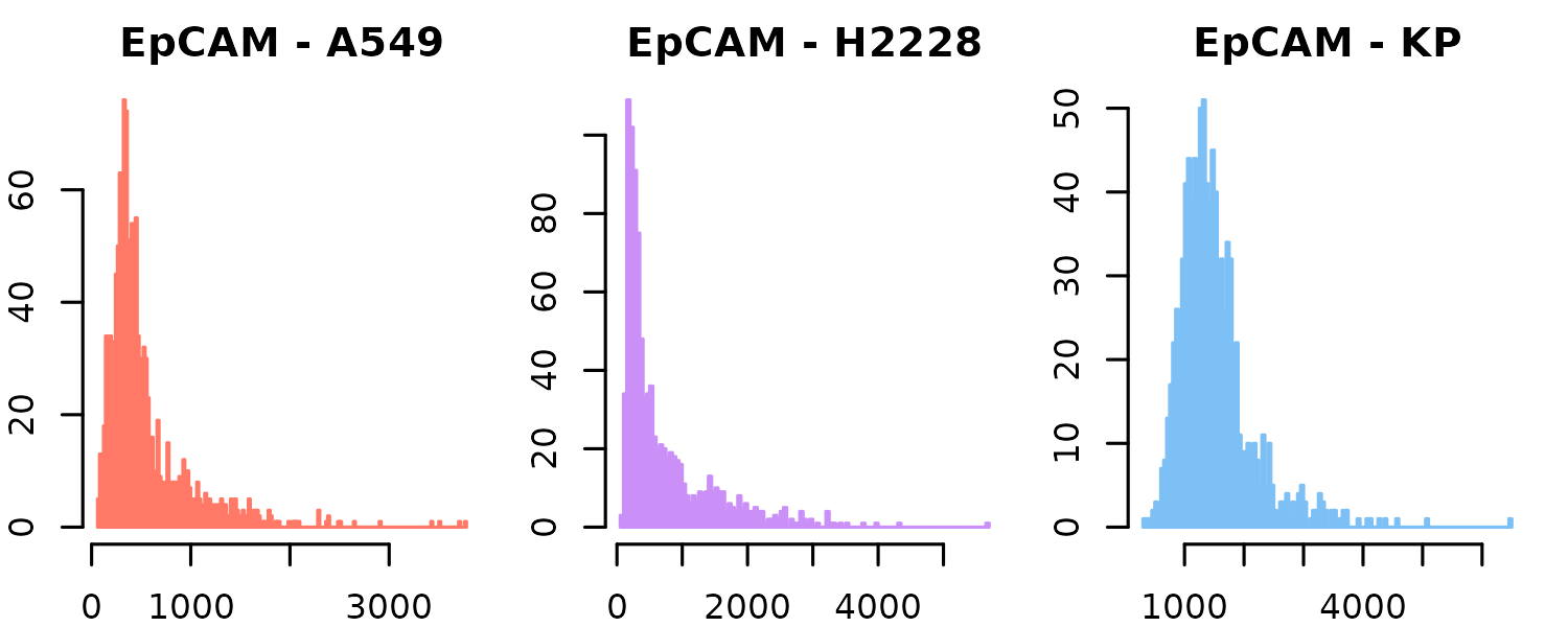
You can see that most EVs from the A549 and H2228 cell lines have EpCAM expression values near 0, while those from the KP1.9 cell line are more centered around 1000. This could reflect one of two possibilities: (1) EVs from the KP1.9 cell line genuinely express higher levels of EpCAM, accurately capturing the underlying biology, or (2) there may be a technical bias—such as differences in staining efficiency, imaging intensity, or batch effects—that artificially inflates the measured scores in KP1.9 samples.
plotDistribution(
    obj = cyg,
    plot_markers = "PanEV",
    matrix = "Raw_Score",
    group_by = "celltype",
    group_colors = c("A549" = "#FF7966", "H2228" = "#CB8FF8", "KP" = "#7CC0F6")
)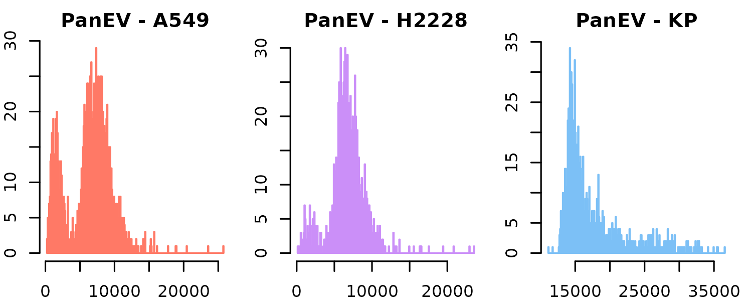
Indeed, when examining the distribution of PanEV, we see that its expression is consistently higher across all KP1.9 EVs. In this context, PanEV refers to a set of markers used to detect the presence of EVs. This overall shift in marker expression suggests a potential global bias, which can be addressed through normalization, as demonstrated in the following section.
Normalizing by PanEV
PanEV expression often correlates with EV size. The following function normalizes marker intensities by PanEV expression to account for this effect.
cyg <- normalizeByPanEV(cyg, "PanEV")
plotDistribution(cyg, matrix = "normalized_exp_mat") +
  theme(text = element_text(size = 8))
## NULL
plotDistribution(
    obj = cyg,
    plot_markers = "EpCAM",
    matrix = "normalized_exp_mat",
    group_by = "celltype",
    group_colors = c("A549" = "#FF7966", "H2228" = "#CB8FF8", "KP" = "#7CC0F6")

)
Scaling Expression Matrices
Some markers may show a wider range of expression due to technical or experimental variation. To account for this and enable meaningful comparisons across markers, the expression matrix can be scaled.
cyg <- scaleExpressionMatrix(cyg)
plotDistribution(cyg, matrix = "scaled_exp_matrix")
# All expression values are between 0 and 1 now!It is also possible to normalize by PanEV first, then scale the normalized scores to enable comparisons across markers. Cygnus provides a flexible analysis workflow designed to accommodate diverse data types and varying analytical needs.
Selection of Relevant Markers
To visualize differences in average marker expression across metadata groups, you can create a heatmap using the following function:
plotAvgHeatmap(cyg, "celltype", scale = "row")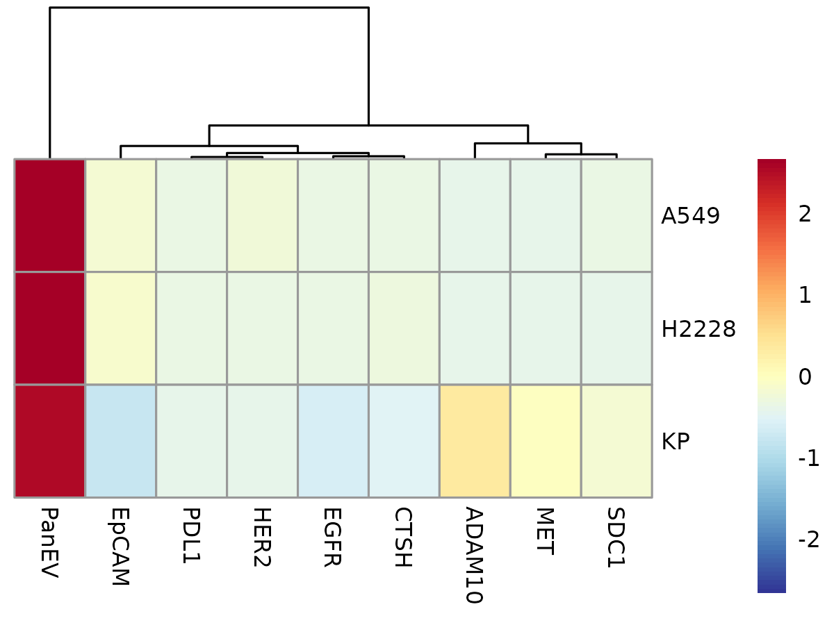
Here, you can see that PanEV is highly expressed across all cell lines. As mentioned earlier, this is expected because PanEV represents a group of markers used to detect the presence of EVs. Therefore, if PanEV doesn’t provide meaningful variation, it might be best to exclude it from downstream analysis.
Relevant markers can be selected using the following method:
cyg <- markRelevantMarkers(cyg, c("EpCAM", "MET",
                               "SDC1", "EGFR", "ADAM10",
                               "CTSH", "PDL1", "HER2"))
Marker relevancy is stored as logical values in the markers_meta slot of the object. You can update these values at any point during the analysis to easily include or exclude markers as needed.
cyg@markers_meta## $marker
## [1] "PanEV" "EpCAM" "MET" "SDC1" "EGFR" "ADAM10" "CTSH" "PDL1"
## [9] "HER2"
##
## $relevant
## PanEV EpCAM MET SDC1 EGFR ADAM10 CTSH PDL1 HER2
## FALSE TRUE TRUE TRUE TRUE TRUE TRUE TRUE TRUENow, we can only plot relevant markers using the AverageHeatmap functionality:
plotAvgHeatmap(cyg, "celltype", only_relevant_markers = TRUE, scale = "row")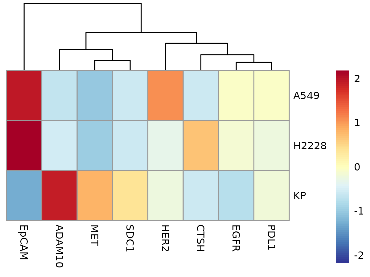
Analyzing Marker Co-localization
Cygnus supports data analysis from two complementary perspectives: marker-centered and EV-centered. In other words, it can focus either on the behavior and interactions of markers or on the characteristics of individual EVs. For example, when focusing on markers, you can explore the likelihood of co-localization among a set of markers. Alternatively, the EV-centered workflow helps identify rare EV subtypes. These two perspectives are closely related and can often be visualized together. We will begin by exploring methods to analyze marker co-localization.
Creating a Binary Matrix
To determine whether a set of markers are present simultaneously on EVs, expression levels for each marker can be converted into binary sscores: 1 if expressed, 0 if not. This binarization is particularly useful because it allows co-localization to be analyzed using set-based approaches—treating presence as membership in a group (1) and absence as non-membership (0).
In this example, a hard threshold of 1000 is applied: if the Raw_Score is greater than 1000, the binary score is 1; if less, it’s 0. For greater flexibility, thresholds can be specified as a vector with unique cutoffs for each marker. Cygnus also offers alternative methods to determine thresholds, such as using IgG distributions to correct for non-specific binding.
cyg <- createBinaryMatrix(cyg, thresholds = 5000)
head(cyg@matrices$binary_exp_matrix)
## PanEV EpCAM MET SDC1 EGFR ADAM10 CTSH PDL1 HER2
## 1 1 0 0 0 0 0 0 0 0
## 2 1 0 0 0 0 0 0 0 0
## 3 1 0 0 0 0 0 0 0 0
## 4 1 0 0 0 0 0 0 0 0
## 5 1 0 0 0 0 0 0 0 0
## 6 1 0 0 0 0 0 0 0 0
# Distribution can be plotted as well
# You can see that everything is either 0 or 1!

#plotDistribution(cyg, matrix = "binary_exp_matrix") +
#  theme(text = element_text(size = 8))
Computing Deviations and p-values
Cygnus calculates the deviation—the difference between observed and expected counts—for each marker intersection. It then estimates p-values by running simulations under the null hypothesis that all markers are independent. More details can be found here.
colocal_marker <- getColocalizedMarkers(cyg)## [1] "Calculating expected and observed probabilities..."
## [1] "Running simulation to calculate the null distribution of deviations..."
head(colocal_marker)## EpCAM MET SDC1 EGFR ADAM10 CTSH PDL1 HER2 Intersection Observed
## 1 0 0 0 0 0 0 0 0 00000000 2430
## 2 0 0 0 0 0 0 0 0 00000000 2430
## 3 0 0 0 0 0 0 0 0 00000000 2430
## 4 0 0 0 0 0 0 0 0 00000000 2430
## 5 0 0 0 0 0 0 0 0 00000000 2430
## 6 0 0 0 0 0 0 0 0 00000000 2430
## Expected_Probability Expected_Count Actual_Deviation MeanDeviation
## 1 0.5569637 1817.929 612.0705 -1.899493
## 2 0.5569637 1817.929 612.0705 -1.899493
## 3 0.5569637 1817.929 612.0705 -1.899493
## 4 0.5569637 1817.929 612.0705 -1.899493
## 5 0.5569637 1817.929 612.0705 -1.899493
## 6 0.5569637 1817.929 612.0705 -1.899493
## SDDeviation p_value p_adj p_adj_capped log10_p_adj significant
## 1 12.50572 0 0 1e-300 300 *
## 2 12.50572 0 0 1e-300 300 *
## 3 12.50572 0 0 1e-300 300 *
## 4 12.50572 0 0 1e-300 300 *
## 5 12.50572 0 0 1e-300 300 *
## 6 12.50572 0 0 1e-300 300 *After computing deviations and their associated p-values, marker co-localizations can be visualized using an UpSet plot from the ComplexUpset package.
# plotUpSet(cyg, markers = c("EpCAM", "MET",
#                            "SDC1", "EGFR", "ADAM10",
#                            "CTSH", "PDL1", "HER2"),
#           nsets = 10, keep.order = TRUE)


plotUpset(cyg, colocal_marker, threshold_count = 10)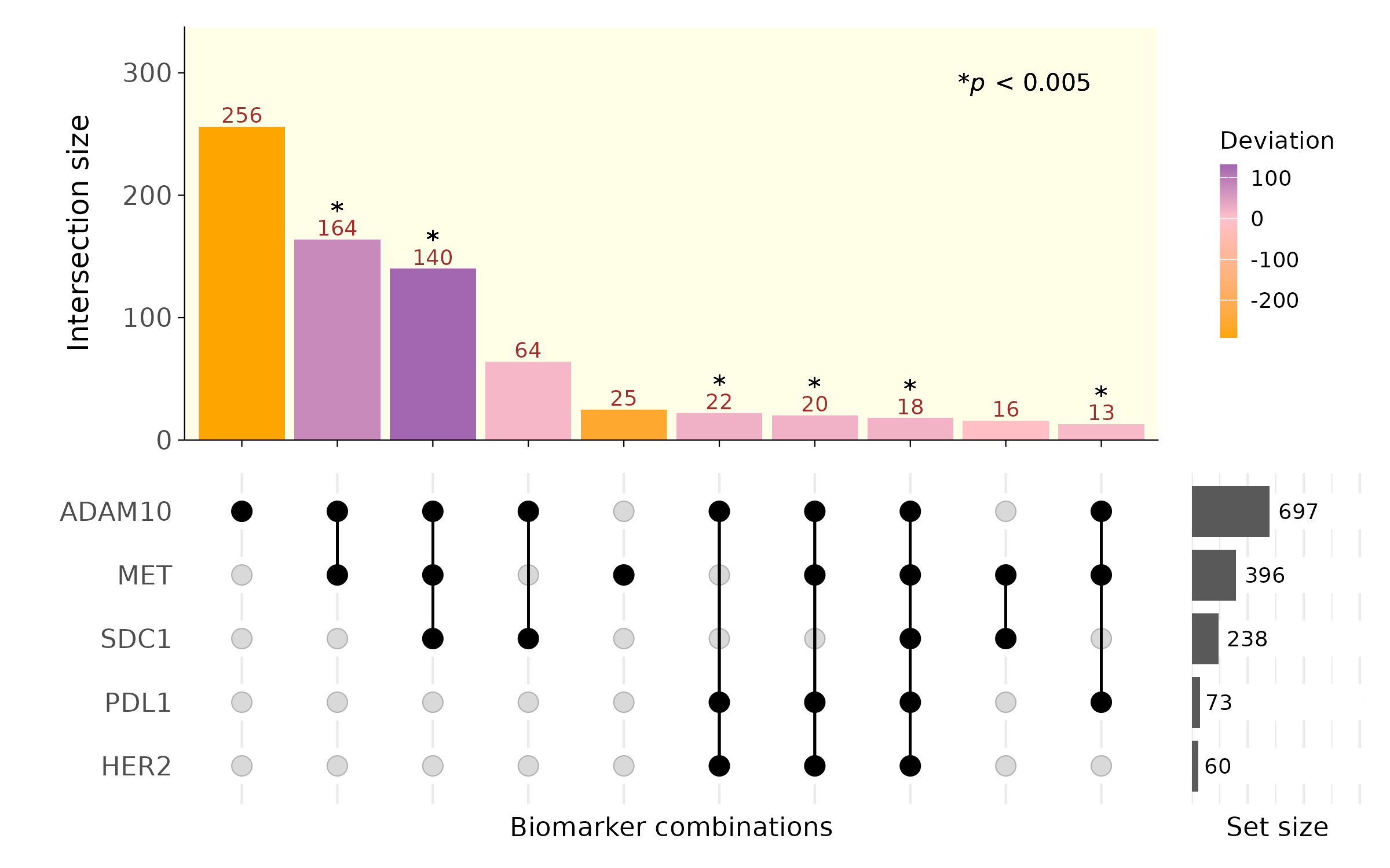
Alternatively, a volcano plot can be used to more easily visualize significant intersections. Here, each intersection is labelled as a binary code, in the order of relevant markers.
plotVolcano(colocal_marker)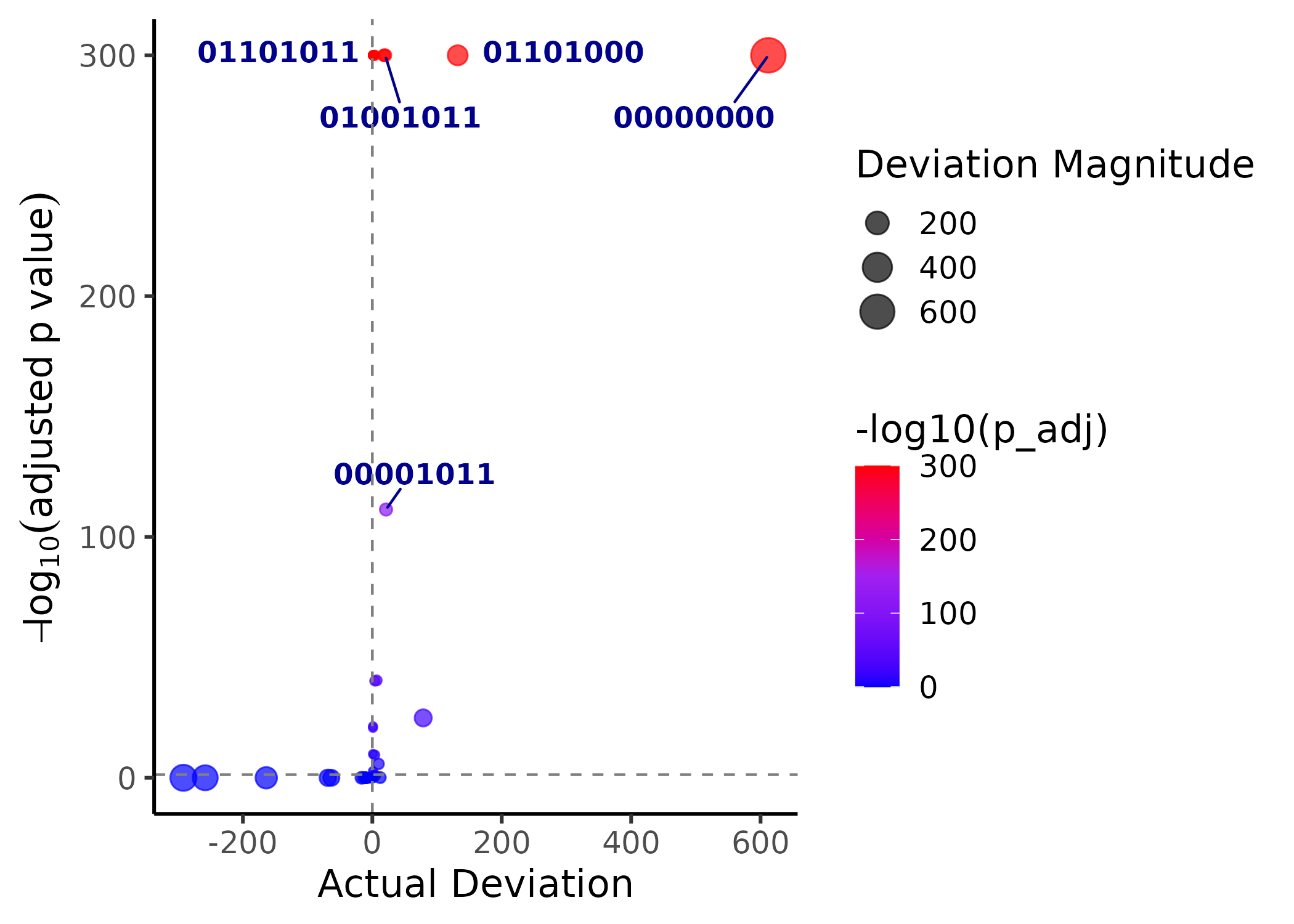
Dimensionality Reduction and Clustering
Dimensionality Reduction
Because multiplex imaging data is high-dimensional, dimensionality reduction is essential for effective visualization and interpretation. Cygnus supports PCA, t-SNE, and UMAP, each of which can be run and visualized using separate functions, as demonstrated here:
PCA
cyg <- runPCA(cyg, matrix_name = "normalized_exp_mat")
plotPCA(cyg, color_by = "celltype",plot_3d = T)
Note that we can run PCA with the raw, and un-normalized matrix as well:
Here, you can observe that the KP1.9 cell line appears quite distinct from the other two cell lines, but this difference is effectively reduced after normalization.
t-SNE
set.seed(100)

cyg <- runTSNE(cyg, matrix_name = "normalized_exp_mat")
plotTSNE(cyg, color_by = "celltype", marker_size = 2, plot_3d = T)
It is also possible to color by marker expression in different matrices:
plotTSNE(cyg, color_by = "EpCAM", marker_size = 5, matrix_name = 'Raw_Score')
plotTSNE(cyg, color_by = "EpCAM", marker_size = 5, matrix_name = 'normalized_exp_mat')
plotTSNE(cyg, color_by = "EpCAM", marker_size = 5, matrix_name = 'binary_exp_matrix')UMAP
cyg <- runUMAP(cyg, matrix_name = "normalized_exp_mat")## 02:27:02 UMAP embedding parameters a = 0.9922 b = 1.112## 02:27:02 Converting dataframe to numerical matrix## 02:27:02 Read 3264 rows and found 8 numeric columns## 02:27:02 Using FNN for neighbor search, n_neighbors = 30## 02:27:03 Commencing smooth kNN distance calibration using 2 threads with target n_neighbors = 30
## 02:27:03 Initializing from normalized Laplacian + noise (using irlba)
## 02:27:03 Commencing optimization for 500 epochs, with 132488 positive edges
## 02:27:03 Using rng type: pcg
## 02:27:06 Optimization finished
plotUMAP(cyg, color_by = "celltype", marker_size = 5, plot_3d = T)Clustering
Cygnus offers three different methods of unsupervised clustering: K-means, HDBSCAN, and leiden.
# HDBscan - Noise points are given a value of 0, so increment by 1.
cyg <- ClusterCygnus(CygnusObject = cyg,
                     use.dims = "tSNE",
                     relevant_markers = TRUE,
                     matrix_name = "scaled_exp_matrix",

                     clustering_method = "hdbscan",
                     hdb_min_cluster_size = 10)

plotTSNE(cyg, color_by = 'hdbscan_clusters', marker_size = 5)
# leiden
cyg <- ClusterCygnus(CygnusObject = cyg,
                     use.dims = "tSNE",
                     relevant_markers = TRUE,
                     matrix_name = "scaled_exp_matrix",

                     clustering_method = "leiden",
                     graph_distance=500,
                     leiden_resolution =0.1)

plotTSNE(cyg, color_by = 'leiden_clusters', marker_size = 5)
# No dim
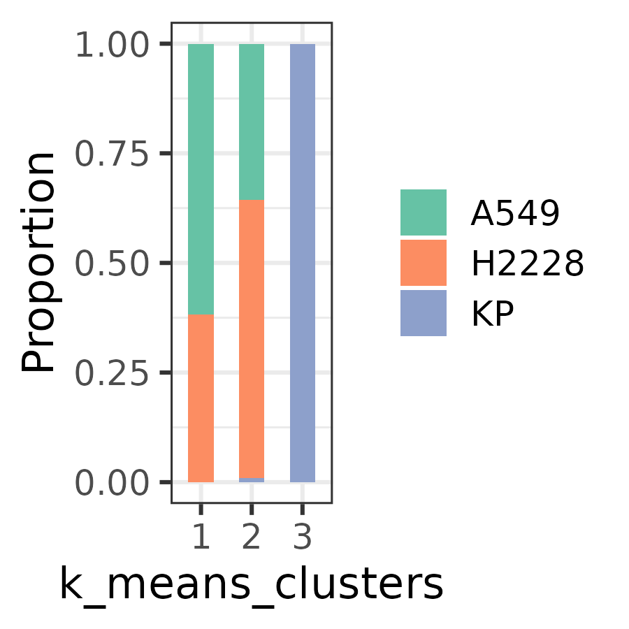
cyg <- ClusterCygnus(CygnusObject = cyg,
use.dims = "None",
relevant_markers = TRUE,
matrix_name = "scaled_exp_matrix",
clustering_method = "kmeans",
n_clusters = 3)
plotUMAP(cyg, color_by = 'k_means_clusters', marker_size = 5) Clusters and their proportions can be visualized using the following approach:
plotBar(cyg, color_by = "celltype", split_by = "k_means_clusters")